Load Duration Curve
Executive Summary
This document provides a basic example of developing flow duration curves (FDCs) and pollutant load duration curves (LDCs) using R. The purpose of this guide is to get you started. Every project will have unique requirements and different decisions that must be made by the analyst.
Introduction
Load duration curves (LDCs) are useful for visually assessing pollutant loading in streams. LDCs are an extension of flow duration curves (FDCs). Flow duration curves are a type of cumulative distribution function that shows the percent of time (typically days) that streamflow values (typically mean daily streamflow) are exceeded. Specifically, the FDC displays the an exceedance probability \(p\) on the x-axis and an associate discharge value \(Q\) on the y-axis (Vogel and Fennessey 1994).
When we have a large number of daily streamflow measurements, we can calculate \(p\):
\[ p = \frac{M}{n+1} \] where \(M\) is the ranked value (low flow to high flow) of a given value of \(Q\) and \(n\) is the number of measurements. When we have fewer values, there are several methods for estimating continuous quantiles, typically with linear interpolation between points. See Hyndman and Fan (1996) and Vogel and Fennessey (1994) for more information.
The LDC is calculated directly from the FDC by (1) converting the mean daily discharge (typically cfs) into daily streamflow volume and (2) multiplying the daily stream volume by the allowable pollutant concentration. The result is the allowable daily pollutant load on the y-axis and the exceedance probability on the x-axis. The specific conversion factors will depend on the units used for pollutant concentrations and desired output units. More information about technical consideration in the development of LDCs is available in U.S. Environmental Protection Agency (2007). The remainder of this document focuses on the steps to create the FDC and LDC.
Software and Data
This guide uses R to calculate and develop the curves. However, these calculations are relatively simple and can be easily done in Excel or most any other spreadsheet or statistical software.
In this example, the R project folder is structured something like the following:
📦ProjectFolder
│   📜.Rhistory
│   📜LDC-Example.Rproj
│
├───📂Data
│       📜SWQM-12517-P31699.txt
│       📜SWQM-15325-P31699.txt
│
├───📂Figures
├───📂Output-Data
└───📂Script
        📜LDC-Script.R
        📜Download-Discharge.R
where the water quality data is stored in the data folder, scripts are in the scripts folder, and folders are available for our outputs.
R Packages
The following code chunk installs and loads the R packages that will be used in this example:
## install packages from CRAN
install.packages(c("dataRetrieval", "tidyverse", "janitor", "remotes"))
## install package from Github
remotes::install_github("TxWRI/twriTemplates")
## load packages
library(dataRetrieval)
library(tidyverse)
library(janitor)
library(twriTemplates)
Download Flow Data
We can use R to directly download USGS streamflow data if that is going to be used in the project. Setup a script to download and save this data into the data 📂. This ensures the data is locally available for analysis even if the internet or USGS servers are down. In the file tree above, this file is Download-Discharge.R.
In this example we are downloading mean daily discharge at USGS gage 08162600 (Tres Palacios) using the USGS dataRetrieval package.
## download mean daily flow from USGS
Q_df <- readNWISdv(siteNumbers = "08162600",
           startDate = "2000-01-01",
           endDate = "2020-12-31",
           parameterCd = "00060",
           statCd = "00003")
Q_df <- renameNWISColumns(Q_df)
Always plot the data to make sure it looks reasonable and covers the data period we want.
ggplot(Q_df) +
  geom_line(aes(Date, Flow)) +
  theme_TWRI_print()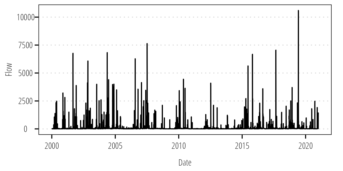
Figure 1: Mean daily flow at USGS-08162600.
Read Bacteria Data
If your file structure looks like the example in the software and data section, read in the data like this (modify the file paths and file names as needed):
## Read in the bacteria data
df_12517 <- read_delim("Data/SWQM-12517-P31699.txt",
    "|", escape_double = FALSE, col_types = cols(Segment = col_character(),
        `Station ID` = col_character(), `Parameter Code` = col_character(),
        `End Date` = col_date(format = "%m/%d/%Y"),
        `End Time` = col_skip(), `End Depth` = col_skip(),
        `Start Date` = col_skip(), `Start Time` = col_skip(),
        `Start Depth` = col_skip(), `Composite Category` = col_skip(),
        `Composite Type` = col_skip(), `Submitting Entity` = col_skip(),
        `Collecting Entity` = col_skip(),
        `Monitoring Type` = col_skip(), Comments = col_skip()),
    trim_ws = TRUE)
df_12517 <- clean_names(df_12517)
Again, plot your data to make sure it looks like what we expect:
ggplot(df_12517) +
  geom_point(aes(end_date, value)) +
  scale_y_log10() +
  theme_TWRI_print()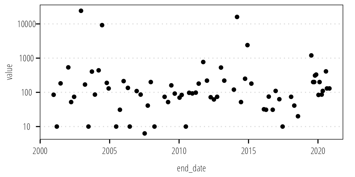
Figure 2: Measured indicator bacteria concentrations at TCEQ-31699
Flow Duration Curve
As mentioned above, the FDC is a plot of flow exceedance (percent or proportion of daily flows exceeded) on the x-axis and the value on the y-axis. We calculate the exceedance value as the rank divided by n+1. This generally works well but how do we handle tied flow values? Some built in R function can deal with that for us automatically. So instead of manually calculating the rank and flow exceedance values we will use the cumulative distribution functions in R.
Q_df <- Q_df %>%
  select(Date, Flow) %>%
  mutate(FlowExceedance = 1-cume_dist(Flow)) ## calculates the flow exceedance
Now we can plot the FDC:
ggplot(Q_df) +
  geom_line(aes(FlowExceedance,
                Flow)) +
  scale_y_log10() +
  labs(x = "Proportion of Days Flow Exceeded",
       y = "Flow (cfs)") +
  theme_TWRI_print()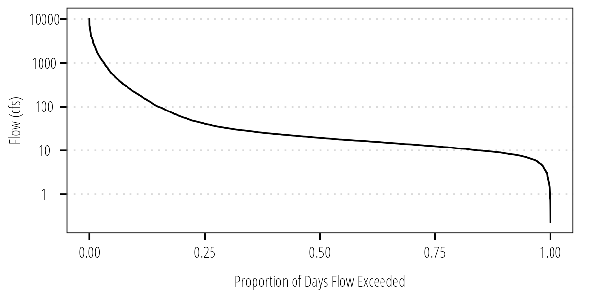
Figure 3: Flow duration curve.
Load Duration Curve
Now we can convert the FDC to an LDC by multiplying the daily flow values by the instream bacteria standard and some conversion factors:
Q_df %>%
  ## MPN/100mL * cubic feet/sec * mL/cubic feet * sec/day = mpn/day
  mutate(LDC = (126/100) * Flow * 28316.8 * 86400) -> Q_df

ggplot(Q_df) +
  geom_line(aes(FlowExceedance, LDC)) +
  scale_y_log10() +
  labs(x = "Proportion of Days Load Exceeded",
       y = expression(paste(italic("E. coli"), " (MPN/day)"))) +
  theme_TWRI_print()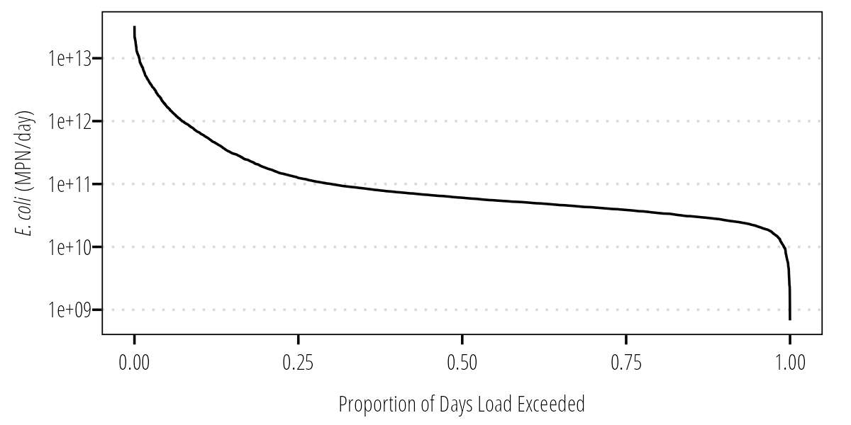
Figure 4: Load duration curve.
It is useful to overlay the measured bacteria values on the LDC. Here we pair measured bacteria concentrations to daily flow by date. Please note, the method of pairing flow values and bacteria concentrations might vary depending on the project. For example, if there are instantaneous flow values that were taken with the bacteria data, it might make sense to bacteria by flow. Talk with your PI and review the literature to make the right decision.
Q_df %>%
  ## join bacteria data by date
  left_join(df_12517 %>%
              select(end_date, value),
            by = c("Date" = "end_date")) %>%
  mutate(MeasuredLoad = (value/100) * Flow * 28316.8 * 86400) -> Q_df
Now we can plot an LDC with bacteria loads overlaid:
ggplot(Q_df) +
  geom_line(aes(FlowExceedance, LDC,
                linetype = "Allowable Load at Geomean Criterion (126 MPN/100 mL)")) +
  geom_point(aes(FlowExceedance, MeasuredLoad,
                 shape = "Measurement Value (MPN/day)",
                 color = "Measurement Value (MPN/day)")) +
  scale_y_log10() +
  labs(x = "Proportion Time Load Exceeded",
       y = expression(paste(italic("E. coli"), " (MPN/day)"))) +
  scale_shape_manual(name = "values", values = c(21)) +
  scale_color_manual(name = "values", values = c("dodgerblue4")) +
  theme_TWRI_print() +
  theme(legend.title = element_blank())
## Warning: Removed 7599 rows containing missing values (geom_point).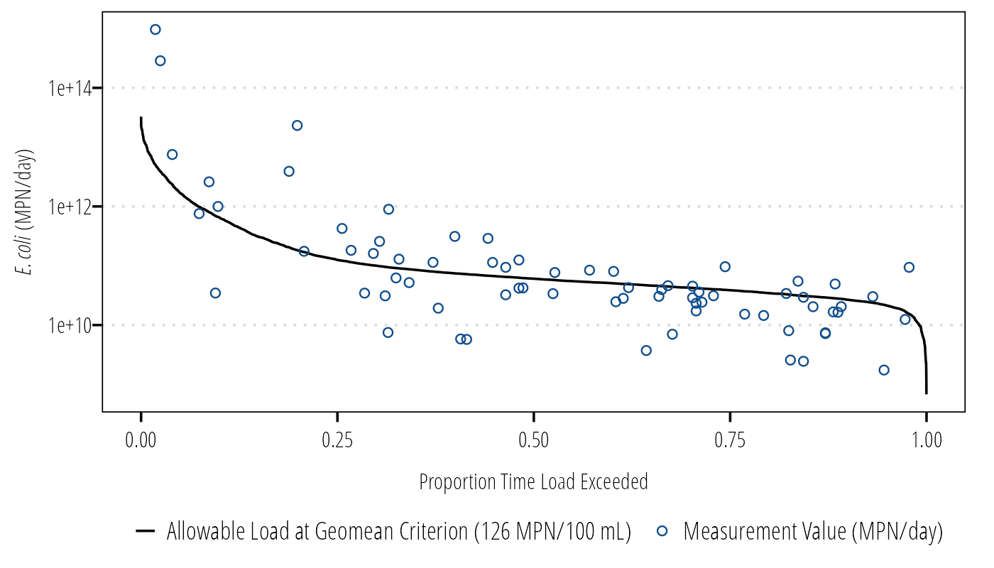
Figure 5: LDC with measured bacteria concentrations.
Calculate Median Conditions
We often want to talk to stakeholders about loadings at different flow conditions and presumably different runoff conditions. We can categorize the flow exceedance into different flow conditions and calculation median flows, allowable loads, measured loads, and calculated estimated necessary reductions:
load_summary <- Q_df %>%
    mutate(Flow_Condition = case_when(
    FlowExceedance >= 0 & FlowExceedance < 0.1 ~ "Highest Flows",
    FlowExceedance >= 0.1 & FlowExceedance < 0.4 ~ "Moist Conditions",
    FlowExceedance >= 0.4 & FlowExceedance < 0.6 ~ "Mid-Range Flows",
    FlowExceedance >= 0.6 & FlowExceedance < 0.9 ~ "Dry Conditions",
    FlowExceedance >= 0.9 & FlowExceedance <= 1 ~ "Lowest Flows"
  )) %>%
  group_by(Flow_Condition) %>%
    summarise(quantileflow = round(quantile(Flow, .5, type = 5, names = FALSE, na.rm = TRUE), 3),
              p = round(quantile(FlowExceedance, .5, type = 5, names = FALSE, na.rm = TRUE), 2),
              geomean_sample = DescTools::Gmean(value, na.rm = TRUE),
              calcload = quantileflow * geomean_sample/100 * 28316.8 * 86400)
load_summary
## # A tibble: 5 × 5
## Flow_Condition quantileflow p geomean_sample calcload
## <chr> <dbl> <dbl> <dbl> <dbl>
## 1 Dry Conditions 12.6 0.75 68.9 2.12e10
## 2 Highest Flows 541 0.05 459. 6.07e12
## 3 Lowest Flows 6.9 0.95 103. 1.74e10
## 4 Mid-Range Flows 19.6 0.5 95.8 4.59e10
## 5 Moist Conditions 40.5 0.25 205. 2.03e11Final Load Duration Curve
ggplot(Q_df) +
  geom_vline(xintercept = c(.10, .40, .60, .90), color = "#cccccc") +
  geom_line(aes(FlowExceedance, LDC,
                linetype = "Allowable Load at Geomean Criterion (126 MPN/100 mL)")) +
  geom_point(aes(FlowExceedance, MeasuredLoad,
                 shape = "Measurement Value (MPN/day)",
                 color = "Measurement Value (MPN/day)")) +
  geom_point(data = load_summary, aes(p, calcload,
                                      shape = "Exisiting Geomean Load (MPN/day)",
                                      color = "Exisiting Geomean Load (MPN/day)")) +
  annotation_logticks(sides = "l", color = "#cccccc") +
  annotate("text", x = .05, y = max(Q_df$MeasuredLoad, na.rm = TRUE) + (0.5 * max(Q_df$MeasuredLoad, na.rm = TRUE)), label = "High\nflows", hjust = 0.5, size = 3, family = "OpenSansCondensed_TWRI", lineheight = 1) +
  annotate("text", x = .25, y = max(Q_df$MeasuredLoad, na.rm = TRUE) + (0.5 * max(Q_df$MeasuredLoad, na.rm = TRUE)), label = "Moist\nconditions", hjust = 0.5, size = 3, family = "OpenSansCondensed_TWRI", lineheight = 1) +
  annotate("text", x = .50, y = max(Q_df$MeasuredLoad, na.rm = TRUE) + (0.5 * max(Q_df$MeasuredLoad, na.rm = TRUE)), label = "Mid-range\nflows", hjust = 0.5, size = 3, family = "OpenSansCondensed_TWRI", lineheight = 1) +
  annotate("text", x = .75, y = max(Q_df$MeasuredLoad, na.rm = TRUE) + (0.5 * max(Q_df$MeasuredLoad, na.rm = TRUE)), label = "Dry\nconditions", hjust = 0.5, size = 3, family = "OpenSansCondensed_TWRI", lineheight = 1) +
  annotate("text", x = .95, y = max(Q_df$MeasuredLoad, na.rm = TRUE) + (0.5 * max(Q_df$MeasuredLoad, na.rm = TRUE)), label = "Low\nflows", hjust = 0.5, size = 3, family = "OpenSansCondensed_TWRI", lineheight = 1) +
  scale_y_log10() +
  labs(x = "Proportion Time Load Exceeded",
       y = expression(paste(italic("E. coli"), " (MPN/day)"))) +
  scale_shape_manual(name = "values", values = c(12, 21)) +
  scale_color_manual(name = "values", values = c("red", "dodgerblue4")) +
  theme_TWRI_print() +
  theme(legend.position = "bottom",
        legend.direction = "vertical",
        legend.title = element_blank())
## Warning: Removed 7599 rows containing missing values (geom_point).
Figure 6: Final LDC.
References
Hyndman, Rob J, and Yanan Fan. 1996. “Sample Quantiles in Statistical Packages.” The American Statistician 50 (4): 5. https://doi.org/10.2307/2684934.
U.S. Environmental Protection Agency. 2007. “An Approach for Using Load Duration Curves in the Development of TMDLs.” EPA 841-B-07-006. U.S. Environmental Protection Agency. https://nepis.epa.gov/Exe/ZyPURL.cgi?Dockey=P1008ZQA.txt.
Vogel, Richard M., and Neil M. Fennessey. 1994. “Flow‐Duration Curves. I: New Interpretation and Confidence Intervals.” Journal of Water Resources Planning and Management 120 (4): 485–504. https://doi.org/10.1061/(ASCE)0733-9496(1994)120:4(485).