Texas Water Resources Institute Data Visualization Style Guide
Executive Summary
Use this data visualization style guide to create a uniform look and feel to all of TWRI’s charts and graphs. The purpose of this guide is to eliminate the burden of design and color decisions when creating charts and establish some minimum expectations of graphic elements. Consider the following information as general guidance only.
Chart Typography
The TWRI and AgriLife brand guides do not specify a font for data visualization usage. We recommend a sans serif font for graphs and charts. Good choices include Arial Nova Cond (Windows), Helvetica Neue Condensed (MacOS), Open Sans Condensed (Open Source). Sizes are general recommendations, minor adjustments might be necessary.
| Chart Parts | Font Weight | Size (Printed) | Size (Web/Presentation) | Case | Notes |
|---|---|---|---|---|---|
| Title | Bold | 13.0 | 18 | Title Case | Optional; conveys main point of the chart. |
| Subtitle | Normal | 10.0 | 14 | Sentence case | Optional; qualifies or clarifies the title. |
| X and Y axis title | Normal | 9.5 | 12 | Sentence case | Include units or multiplies in brackets [million cfu] |
| X and Y axis label | Normal | 9.5 | 12 | Sentence case | Horzontal preferred, avoid units or multipliers. |
| Legend label | Normal | 10.0 | 12 | Sentence case | Horizontal preferred, avoid redundant labels |
| Direct labels | Bold | 9.5 | 12 | Sentence case | Used in line or column charts with three or fewer series. |
| Data point labels | Normal | 9.5 | 12 | Sentence case | Always horizontal. No units. Direct labels are preferable to data legends. |
| Source and notes | Normal | 8.0 | 11 | Sentence case | Optional. |
Chart Parts
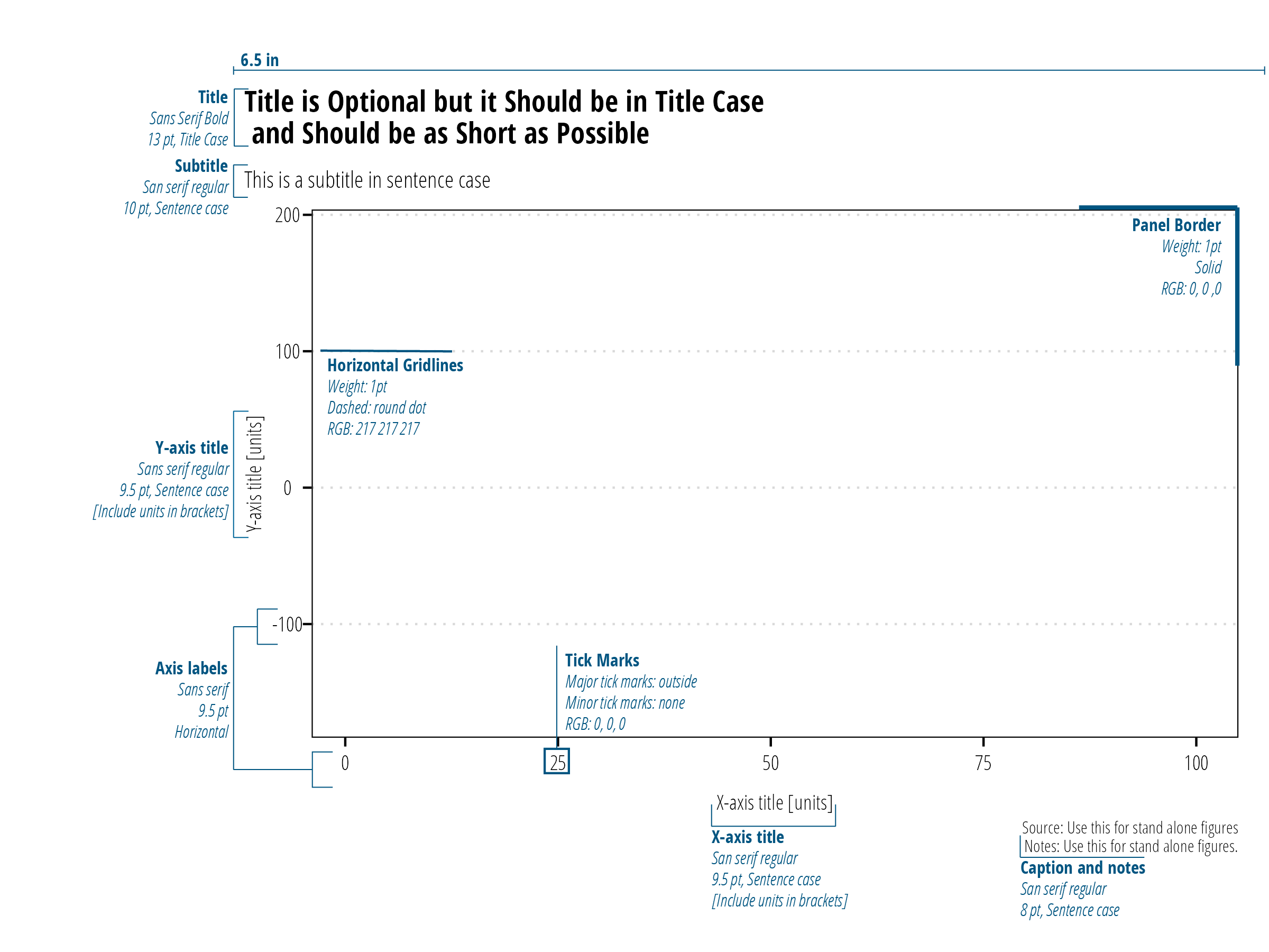
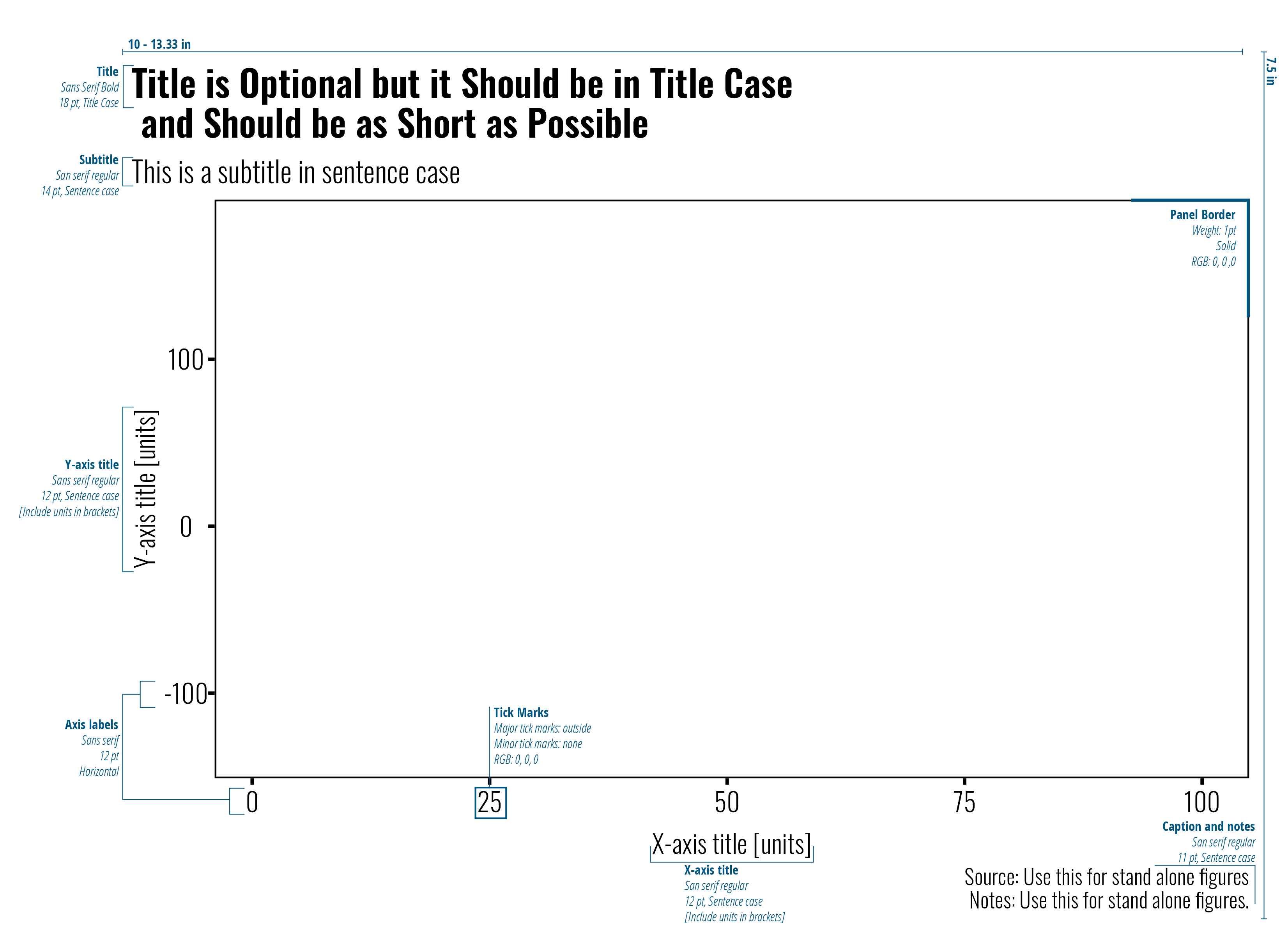
All figures must include axis labels. Axis titles (including units) must be included whenever continuous data is used. We recommend use of axis labels for discrete data, but they can be removed if the measurement variable if obvious and the space is needed (countries is an example of an axis label that isn’t always needed). Panel borders are included on all four sides of the plot. Horizontal gridlines are included for technical report figures. Do not use vertical girdlines or axis ticks on minor breaks. However, the use of minor tick marks on log-scaled axis is encouraged.
Tips:
Titles, subtitles, and in-chart source are reserved for stand-alone figures only. Use figure captions to title and explain figures in technical reports. Notes can be used to define units or abbreviations.
Legends can stretch horizontally along the bottom or stretch vertically on the right.
TWRI technical report body is typically 6.5" wide. Export figures at 6.5" wide to take advantage of the full width in the document. Where available, export figures at high resolution (200-300 dpi).
PowerPoint slides are either 10" wide x 7.5" tall (4:3 aspect slides) or 13.33" wide x 7.5" tall (16:9 aspect slides). Export figures at these dimensions and high resolution (200-300 dpi) to create a full screen figure.
Image Formats
Generally speaking, .png files are the preferred image format. For photographic images or images where accurate color reproduction is required (some maps for example) use .tiff or .jpeg. For detailed discussion of image formats, see https://clauswilke.com/dataviz/image-file-formats.html.
Color
TWRI’s main colors are TWRI Blue (#0054a4), Maroon (#5d0025), Gray (#54565a), and Teal (#82adaa). Color selection is based on the type of data presented. Categorical data are discrete data with no inherent order. Examples include names or places. Sequential data are ordered in a meaningful manner. Often, sequential data is ordered low to high. Diverging data is a type of sequential data where we are interested in the deviance from a middle neutral value. The color palettes shown in Figure 1 take some of the guess work of choosing colors that are largely consistent with TWRI branding.
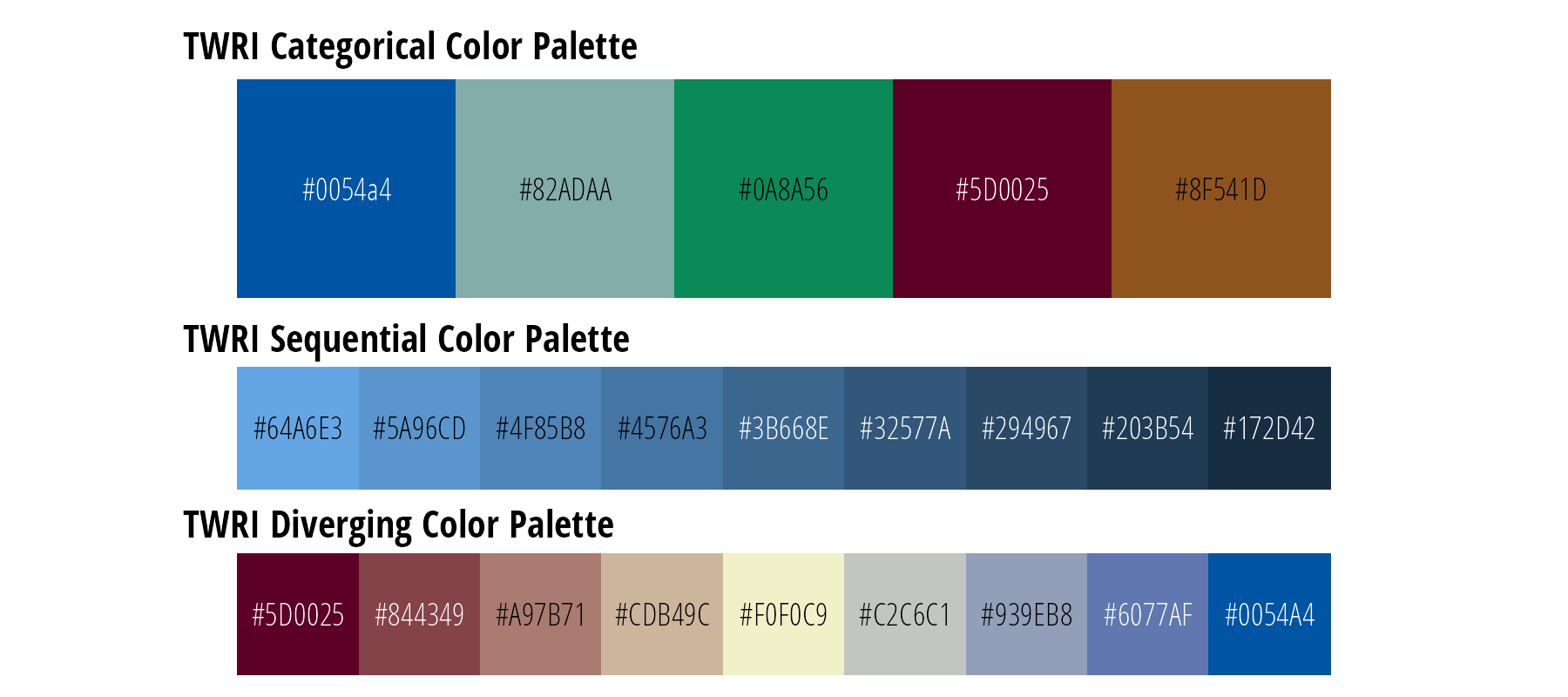
Figure 1: Data visualization color palettes that align with institute branding.
Recognizing that these color palettes are not always suitable or the best option for visualizing data, consider the following very good color palette resources:
Color Brewer
Color Brewer provides a set of discrete color palettes, some of which are colorblind friendly (Figure 2). Use the online tool to select colors based on data type, number of categories, and desired properties. Some examples are shown below.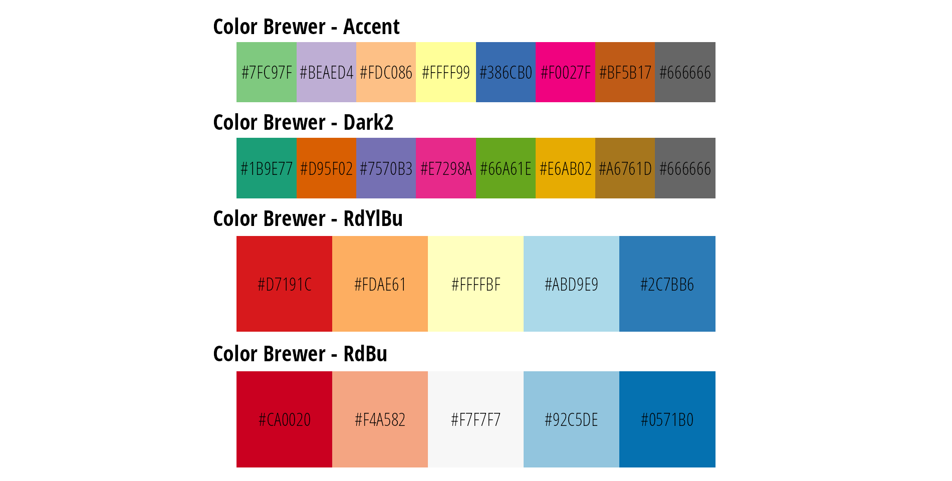
Figure 2: Examples of Color Brewer palettes.
Continuous Color Scales
The mpl color maps used by default in the matplotlib v2.0 Python library are designed for perpetual uniformity and are color blind friendly (Figure 3). There are implementations in R, MatLab, JavaScript/D3, and ArcGIS Pro.
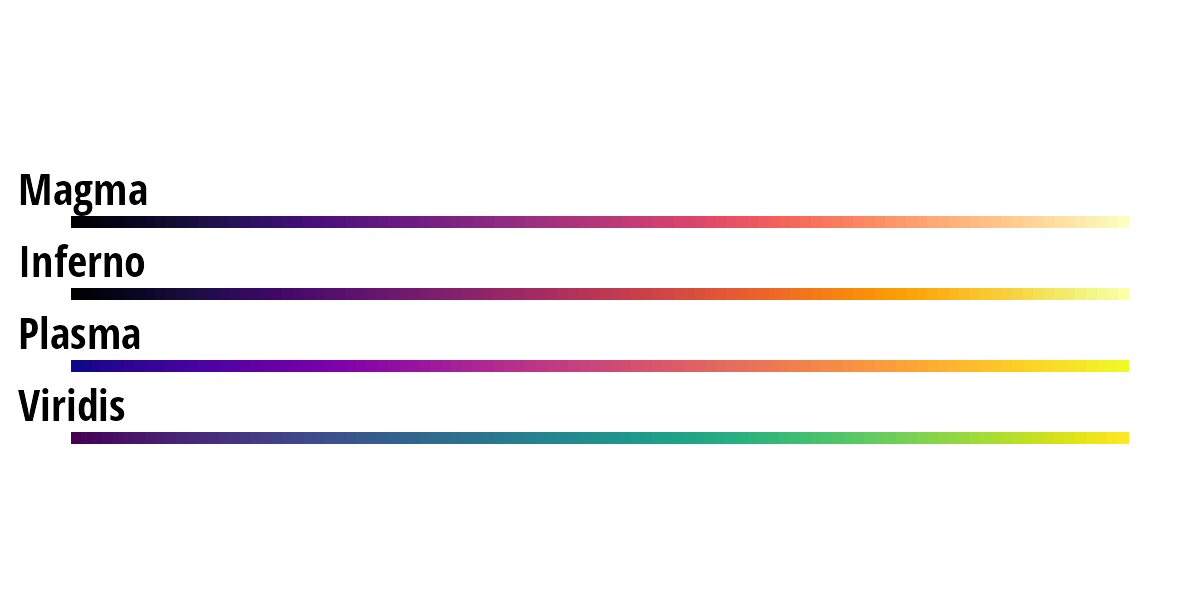
Figure 3: mpl color palettes are suitable for continuous data.
Examples
Bar and Column Plots
Bar and column plots are used to compare the magnitude of measured data across different categories or treatments. Bars and columns can be vertical or horizontal. They can also be grouped or stacked if we want to compare within categorical variables.
Tips
Bar height or length must be meaningful relative to each other. Be thoughtful when using log or square root units on the length axis.
Bars start at zero (dot plots are preferable if the axis does not start at zero).
Consider direct labeling the data values.
If x-axis labels are very long, flip the graph horizontally.
Consider reordering the observation units by value for easy comparison (low values to high values)
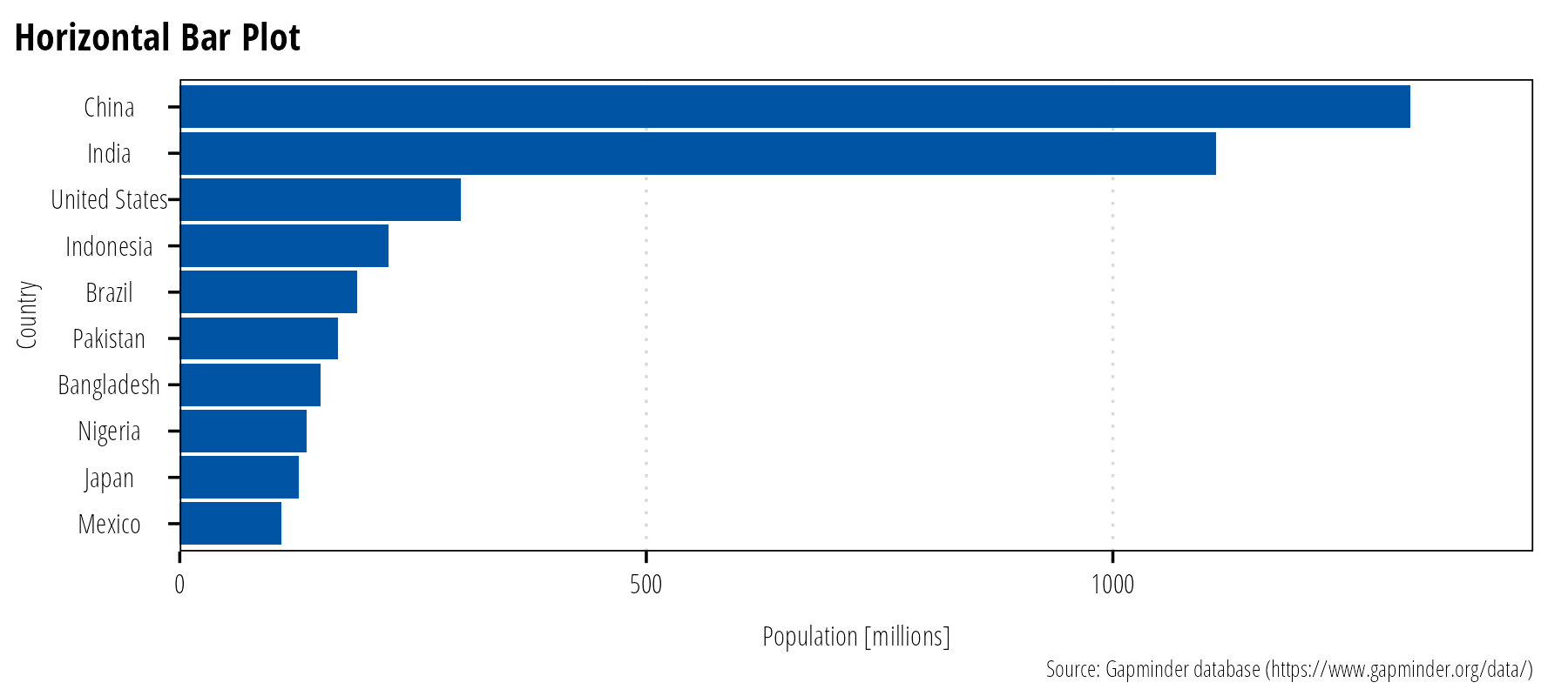
Figure 4: Bar or column plots are used to compare one observational variable across categories.
Line Graphs
Line graphs are typically used to display trends over time. Use different colors or line types to compare observation units on the same graph (Figure 5). Line graphs can also be used to display functional relationships between two variables, regression lines are an example.
Tips
If you have many lines, highlight and label the data you want to convey (Figure 6).
Discretely measured events should be shown as points, not connected lines. The lines imply data measurements between two discrete events. For example, if your x axis units are day but the measurements are a month apart, use points. However, if your x-axis units are month, then a line is appropriate.
Regression lines should be plotted with the data to convey adequacy of the fit.
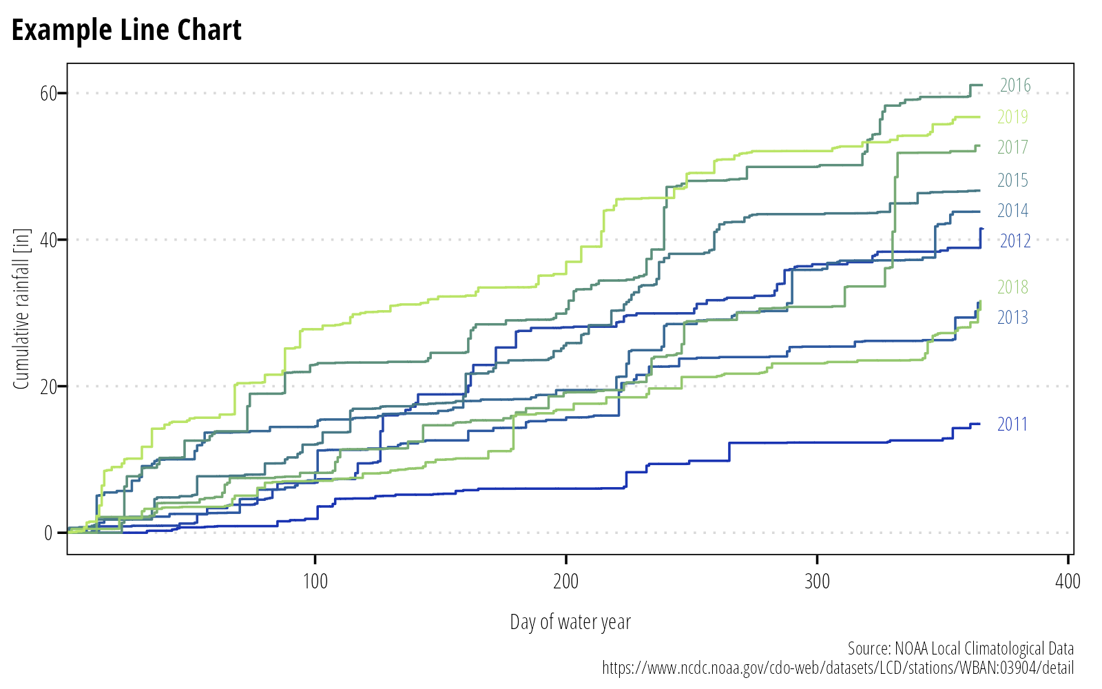
Figure 5: Use colors and directly label lines where possible.
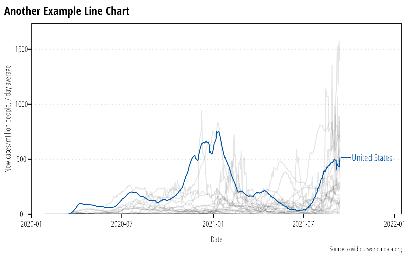
Figure 6: Highlight important data if there are too many observational units for the reader to discern.
Scatterplots
Basic scatterplots are used to display the relationship between two or more quantitative variables. The x and y axis are used to show quantitative measurements. Color and size can be added to convey additional quantitative or qualitative information (Figure 7).
Tips
If there is inherent order to the measurements, it may help to connect points with a line.
If there are a large number of points, use transparency or consider bi-variate density plots.
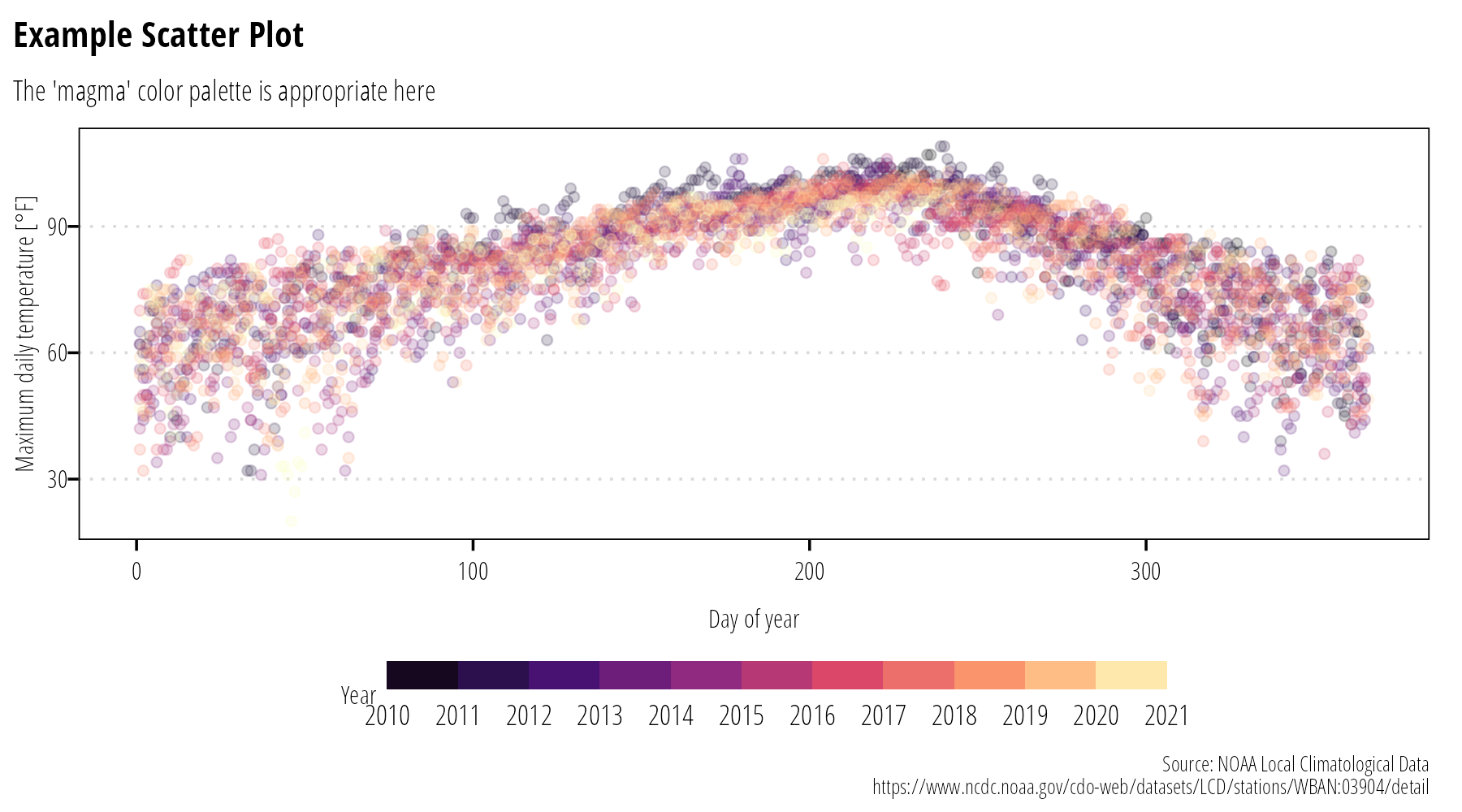
Figure 7: Scatter plots display the relationship between quantitative variables.
Distributions
Histogram
There are numerous ways to show distributions. The classic example is a binned histogram showing the count of observations within a specific bin of the data. The shape of the histogram will vary based on the size of the bins, so play around with bin sizes to understand the underlying data distribution. Histograms should be plotted without spaces between the bars (Figure 8).
## Warning: Removed 104 rows containing non-finite values (stat_bin).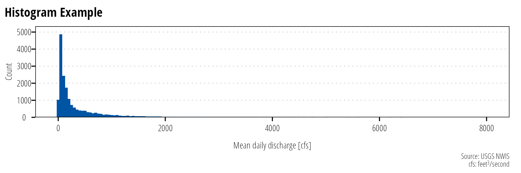
Figure 8: Histograms display the approximate distribution of the data by counting the number of observations within the specifid bins.
Density Plot
Density plots are an alternate method of visualizing distributions. Density plots attempt to draw the probability distribution with a continuous line (Figure 9). If you have many data points, they will generally provide an accurate depiction of the data distribution without having to decide on bin sizes. If it is important to show data missingness, then histograms are a better option.
## Warning: Removed 104 rows containing non-finite values (stat_density).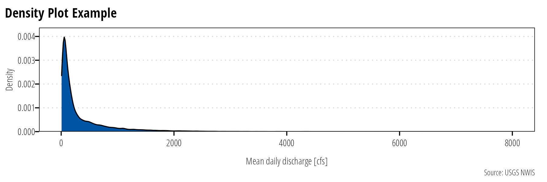
Figure 9: Density plots display the estimated probability distribution of a continuous variable.
Box Plot
Box plots are used to visualize and compare the median, interquartile range, and outliers of a given dataset. Reserve boxplots for technical reports and scientific articles. Generally, they are not suitable for a general audience. Instead show the distribution of points instead (or do both).
Tips
Consider adding a legend explaining the parts of a boxplot (Figure 10).
For datasets with few points, consider adding the measured values as points above the boxplots. This can help identify potential issues with the dataset.
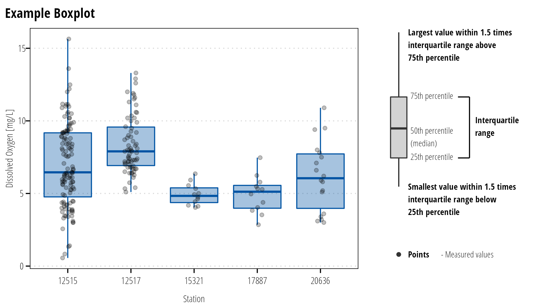
Figure 10: Use boxplots to display the distributional properties of continuous variables.
Survey data
Survey data is often displayed in tables. However, if there is inherent ordering in responses (using a Likert scale for example), we can create compelling visualizations of the distribution of responses. Likert plots center the x-axis on zero and plot “negative” responses to the left and “positive” responses to the right of center (Figure 11). The downside of this plot is that it is difficult to discern and compare exact values. Simple bar plots or stacked barplots might be more effective depending on the message you need to convey.
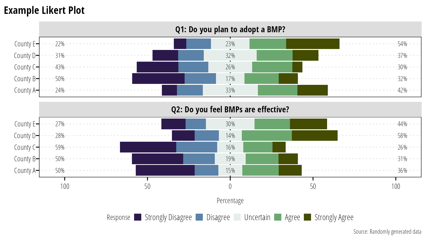
Figure 11: Likert plots are an option for displaying ordered survey response data.
Common Mistakes
Data Transformations
Sometimes we transform data for analysis (log-transforming E. coli data for example). It is better to back-transform the data when plotting it on a graph and using an appropriate scale on the x- and y-axis (Figure 12). It is difficult to interpret the physical meaning of transformed values, by using appropriate scales we retain both the physical meaning of the measured data and the advantages provided by data transformations.
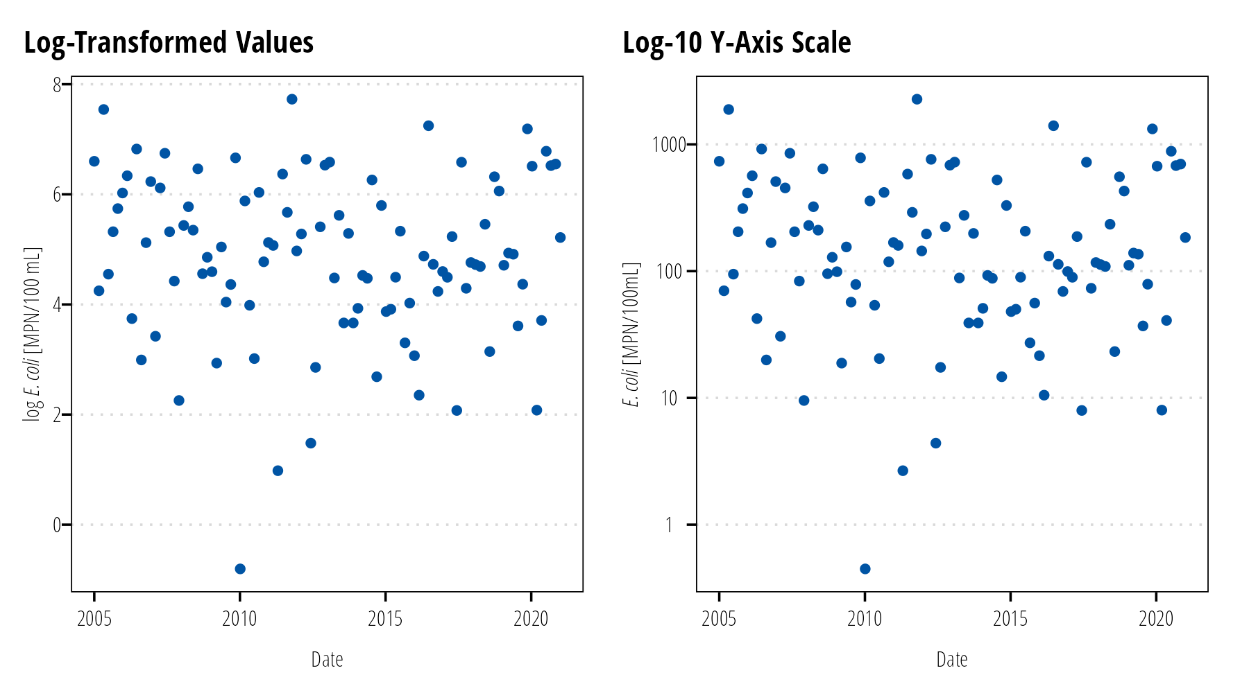
Figure 12: Avoid plotting transformed values (left). Plot untransformed values with transformed scales (right).
Error Bars
Error bars are conventionally used to display the uncertainty in estimates, not the variability or distribution of measured data. Box-plots and histograms are the appropriate graph to show measurement variability. Where error bars are used, indicate if the bars represent the standard error of the mean or confidence intervals. Do not use error bars for standard deviations or maximum/minimum measurements (Figure 13).
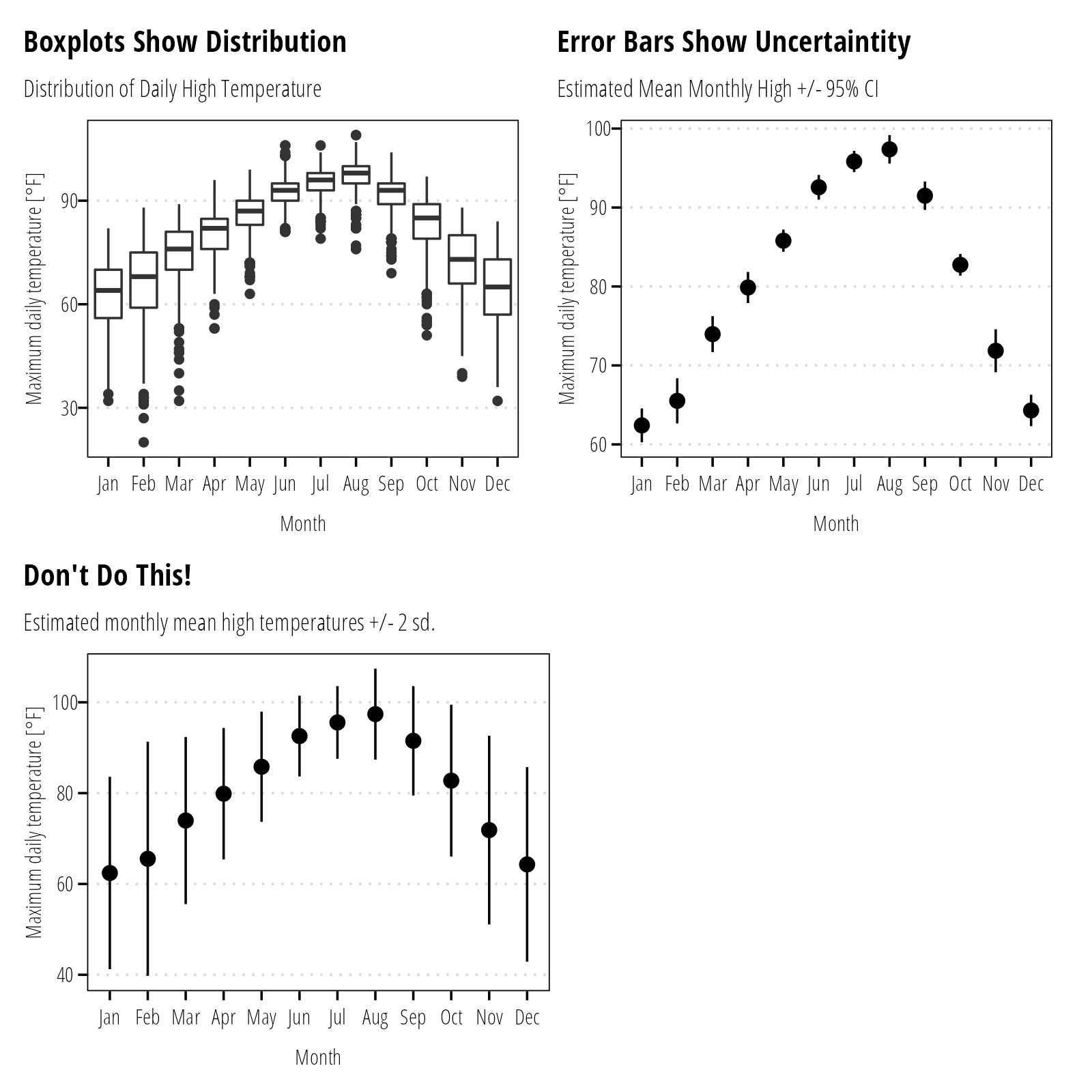
Figure 13: Use error bars to display uncertaintity (standard error, confidence intervals, and prediction intervals) around estimates (mean, median, geomeans). Variability in the data (standard deviation, interquartile range, etc.) should be reflected as histograms, box plots, or other distributional plots.
Visualizing Proportions
The classic data visualization for proportions is the pie chart. Pie charts work well if they emphasize fractional units like 1/2, 1/3, or 1/4. They don’t work well for comparing small differences between groups. Side by side bar charts are preferred when comparing small differences or there are many groups (Figure 14). Stacked bar charts probably work best when comparing changes in proportion over time or among treatments (Figure 15).
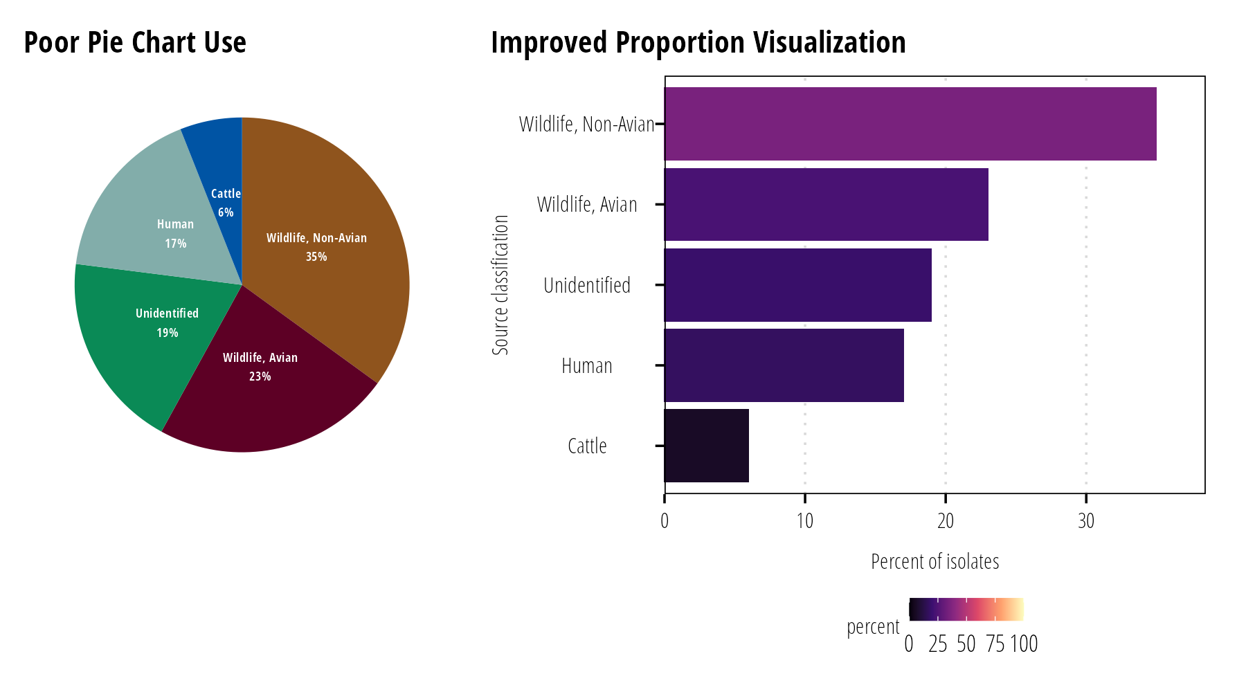
Figure 14: It is difficult to discern small percentage differences with pie charts (left). Generally bar charts facilate easy comparisons between many percentage values (right).
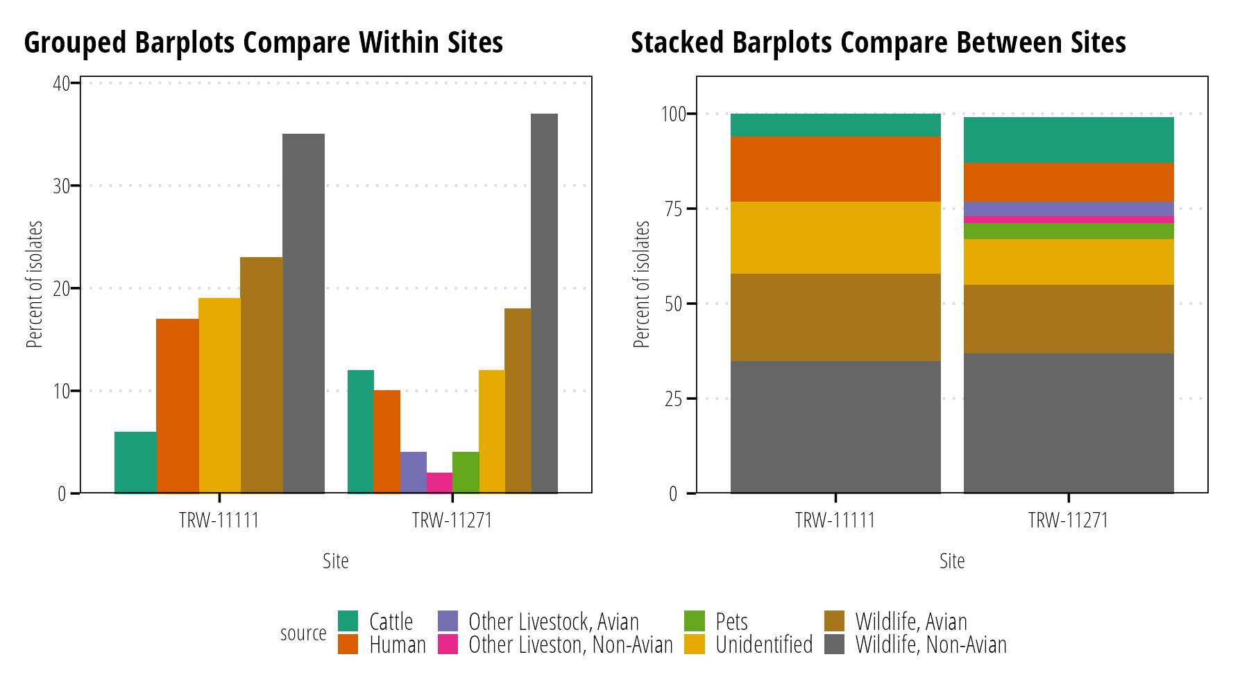
Figure 15: Grouped bar plots allow easy comparison of percentages within sites (left). For comparisons of relative percentages between many sites, stacked bar charts work well at the expense of easily identify exact values (right).
Three Dimensions
Generally speaking, three dimensional visualizations do not translate well to printed figures. Some exceptions topography maps with hillshading, or three dimensional objects (something we rarely encounter in our field). Web graphics that permit rotating of graphs are also a good place to use three dimensional graphics.
Instead of resorting to x-, y-, and z- scales; combine color, size, or shape to incorporate additional continuous or discrete variables. Finally, some software packages allow the use of small multiples plots. Small multiples plots are essentially a gridded multi-panel plot that subset the data into groups and facilitate quick comparisons across those groups.
Software Notes
You are not restricted to using a specific software for data visualization. Typical software tools include Microsoft Excel, ArcGIS Pro, R Statistical Software, Python, SAS, STATA, or SPSS. While you are not restricted to a particular software you are encouraged to store data files in non-proprietary formats when possible. Comma separated value (.csv) files are plain text files that are readable by just about all software. Excel files (.xls, .xlsx) can be opened by other software, but Excel has a bad habit of automatically formatting data or changing values (especially dates). Keep the raw data in a .csv or similar text-based file and do your analysis in a separate .xls file to ensure the raw data is not altered. Scripts written in any other software should also avoid altering the raw data.
Open Source Resources
For additional information on choosing and designing data visualization products see the following resources that are available both freely online and in print form.
Claus Wilke. Fundamentals of Data Visualization. - Describes how to chose and design data visualization based on data type and the message you want to communicate. The book is software agnostic and mainly describes best practices in data visualization and is highly opinionated about design and aesthetics.
Hadley Wickham, Garret Grolemund. R for Data Science. - Focuses on using R as a data processing programming language. Covers the fundamentals of using
Randggplotto do analysis and data visualization. This is highly recommended if you are just getting started usingR.Jake VanderPlas. Python Data Science Handbook. - Introduction to
Pythonas a data analysis programming tool. In particular, a focus on theMatplotlibandSeaborndata visualization libraries.Kieran Healy. Data Visualization: A Practical Introduction. - This book focuses on using
Randggplot2to develop data visualizations. Good follow-up to R for Data Science.Victor Olaya. Introduction to GIS. - An abridged book that introduces GIS concepts and visualization of geographic data. This is a software agnostic book.